
multi design system
Problem
The company needed an integrated design system that is both complex and easy to implement when creating multiple web and desktop projects.Project Goals
- Faster deployment
- Improved collaboration between design → development
- Easy theming (brand A / brand B / white-label)
- Project consistency
1. Choose format
We needed a format for storing tokens that would be easy to use. After considering many options, we chose Storybook and Tokens Studio, as they are both informative and user-friendly.1.1. Storybook & Design Tokens ?
Storybook & Tokens Studio serve as a documentation hub for UI content and elements - such as componentsthat are easy to read, understand,and implement.2. Define layers
We divided the design system tokens into the following layers:- Base (primitives)
- Semantics
- Composites
- Components
2.1 Base
Base layer: all possible values used throughout the entire design system- the so-called primitives. This includes all token types, from spacing and sizing to kerning and line height.2.2 Semantics
Semantic layer: transforms values - only those from the base layer - intofunctional tokens. Unlike the base layer, their names reflect their intended purpose.2.3 Composites
Composites: elements that cannot be defined by a single value. These mainly include typography and shadows.2.4 Components
Component tokens: provide a comprehensive description of a component, covering all its states, border radii, and other details.3. Atomic Design
Atomic Design is a methodology that structures user interfaces by breaking them down into fundamental building blocks - fromatoms to pages.3.1 Atoms
Atoms are the most basic, indivisible UI elements, such as buttons, labels, or text fields. They form the foundation for building more complex structures.3.2 Molecules
Molecules are simple groups of atoms combined into a functional whole. An example is a search form that combines an input field, a button, and a label to perform a specific task.3.3 Organisms
Organisms are relatively complex UI components made up of groups of molecules and/or atoms. An example would be a navigation bar with a logo, menu items, and a search form.3.4 Templates
Templates are page-level structuresthat arrange components in a layout, defining structure and content hierarchy without specifying the final content. They serve as blueprints for pages.3.5 Pages
Pages are specific instances of templates that present the interface with real content, showing how the product will appear to the end user.4. Components
After defining the component structure in Storybook, we create components in Figma. With externaltools, Storybook tokens can be usedas Figma Variables.4.1 Quick handoff
Once changes are made in Storybook, it takes just a few clicks to update the Figma design and hand it off to developers. Handoff has never been this fast.5. Solutions!
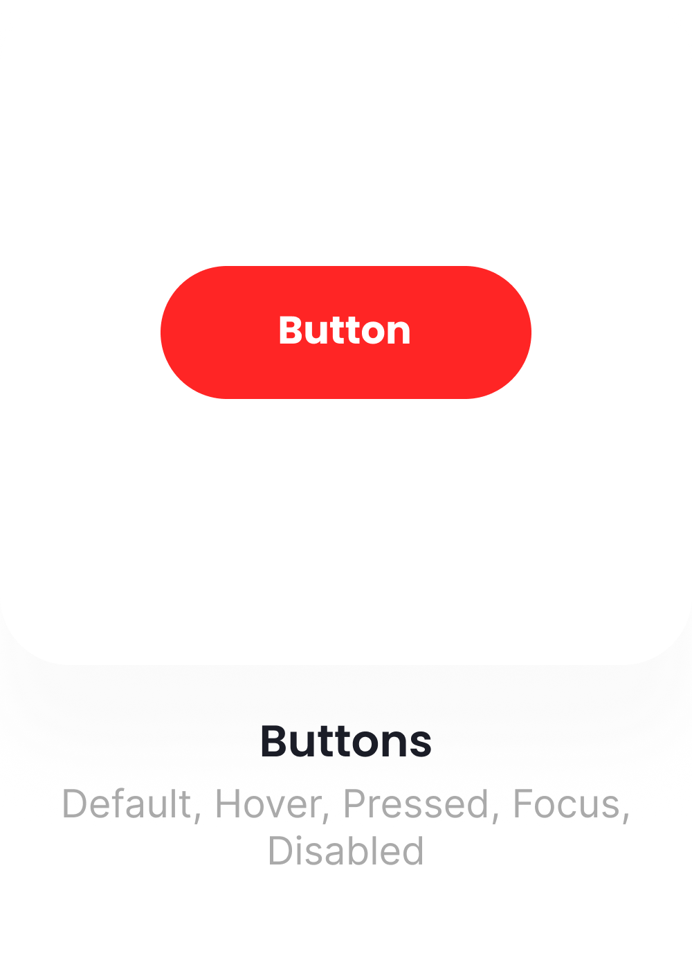
We created a system that allows teams to deliver design changes to development within seconds. It also includes a well-organized token structure that’s intuitive to use across multiple projects simultaneously.'%3e%3crect%20x='7.2002'%20y='9'%20width='23.4'%20height='19.8'%20fill='white'/%3e%3cpath%20fill-rule='evenodd'%20clip-rule='evenodd'%20d='M2.63604%202.63604C0%205.27208%200%209.51472%200%2018C0%2026.4853%200%2030.7279%202.63604%2033.364C5.27208%2036%209.51472%2036%2018%2036C26.4853%2036%2030.7279%2036%2033.364%2033.364C36%2030.7279%2036%2026.4853%2036%2018C36%209.51472%2036%205.27208%2033.364%202.63604C30.7279%200%2026.4853%200%2018%200C9.51472%200%205.27208%200%202.63604%202.63604ZM21.15%2014.4C21.15%2015.1456%2021.7544%2015.75%2022.5%2015.75H23.7408L20.1182%2019.3726C19.9425%2019.5483%2019.6575%2019.5483%2019.4818%2019.3726L16.6274%2016.5182C15.3972%2015.288%2013.4028%2015.288%2012.1726%2016.5182L8.04541%2020.6454C7.5182%2021.1726%207.5182%2022.0274%208.04541%2022.5546C8.57261%2023.0818%209.42739%2023.0818%209.95459%2022.5546L14.0818%2018.4274C14.2575%2018.2516%2014.5425%2018.2516%2014.7182%2018.4274L17.5726%2021.2818C18.8028%2022.512%2020.7972%2022.512%2022.0274%2021.2818L25.65%2017.6592V18.9C25.65%2019.6456%2026.2544%2020.25%2027%2020.25C27.7456%2020.25%2028.35%2019.6456%2028.35%2018.9V14.4C28.35%2013.6544%2027.7456%2013.05%2027%2013.05H22.5C21.7544%2013.05%2021.15%2013.6544%2021.15%2014.4Z'%20fill='%23FF2525'/%3e%3c/g%3e%3cdefs%3e%3cclipPath%20id='clip0_729_8495'%3e%3crect%20width='36'%20height='36'%20fill='white'/%3e%3c/clipPath%3e%3c/defs%3e%3c/svg%3e) Principles & Foundations
Principles & Foundations
Predictable
Accessible by default
Composable
Consistent, not identical
Minimal & purposeful
Flexible by design
One source of truth
Content-first
Performant
Brandable
 Stakeholders
Mobile apps
Desktop apps
Web apps
 Range
Range
Product Owners
Dev Team
Designers
QA
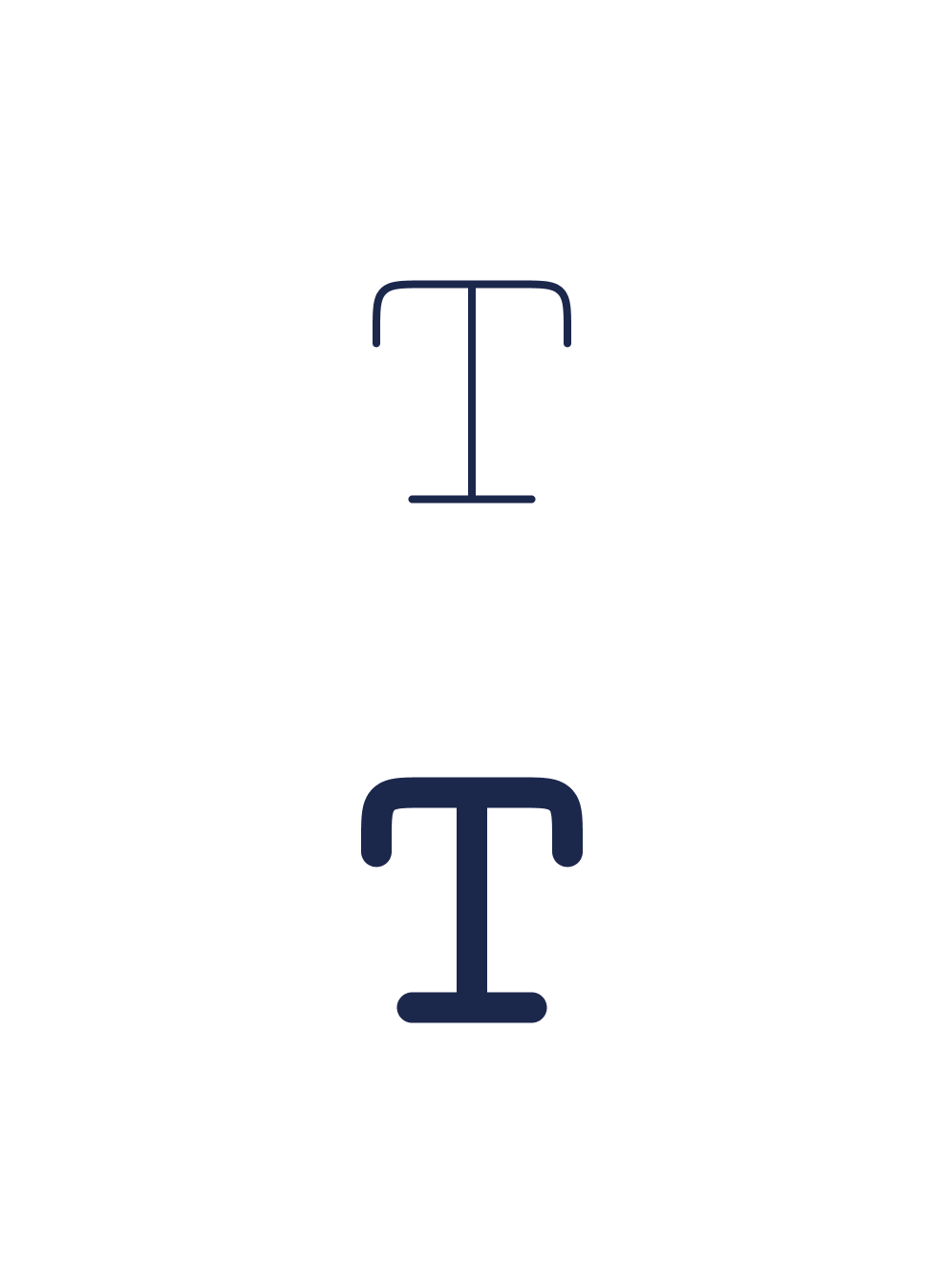
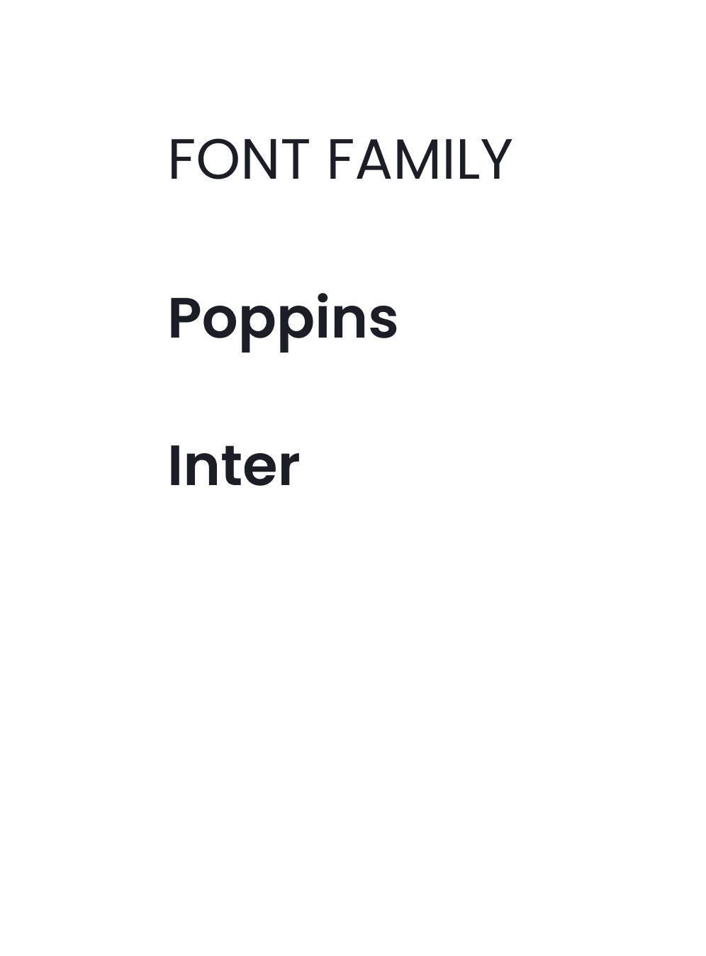
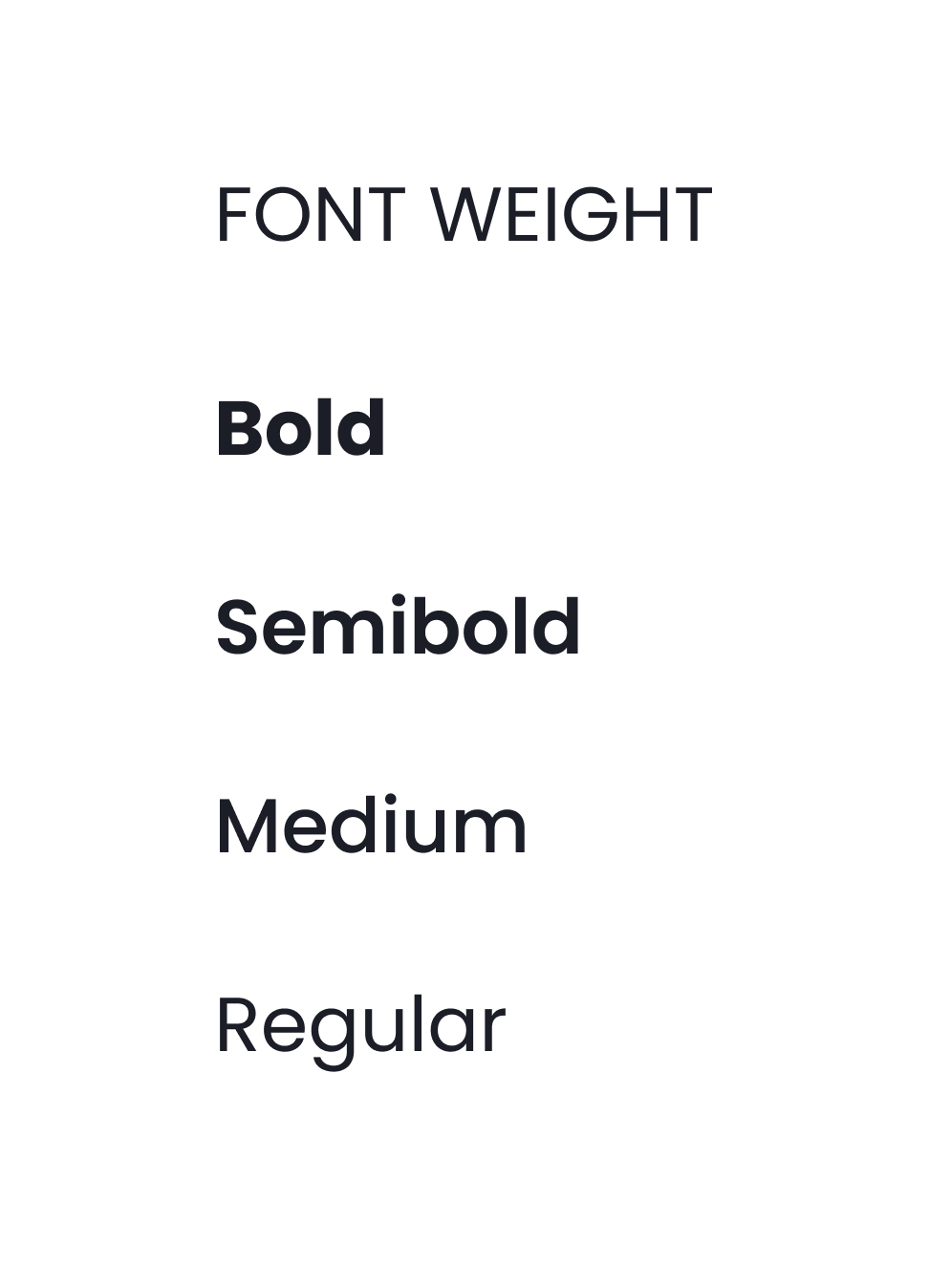
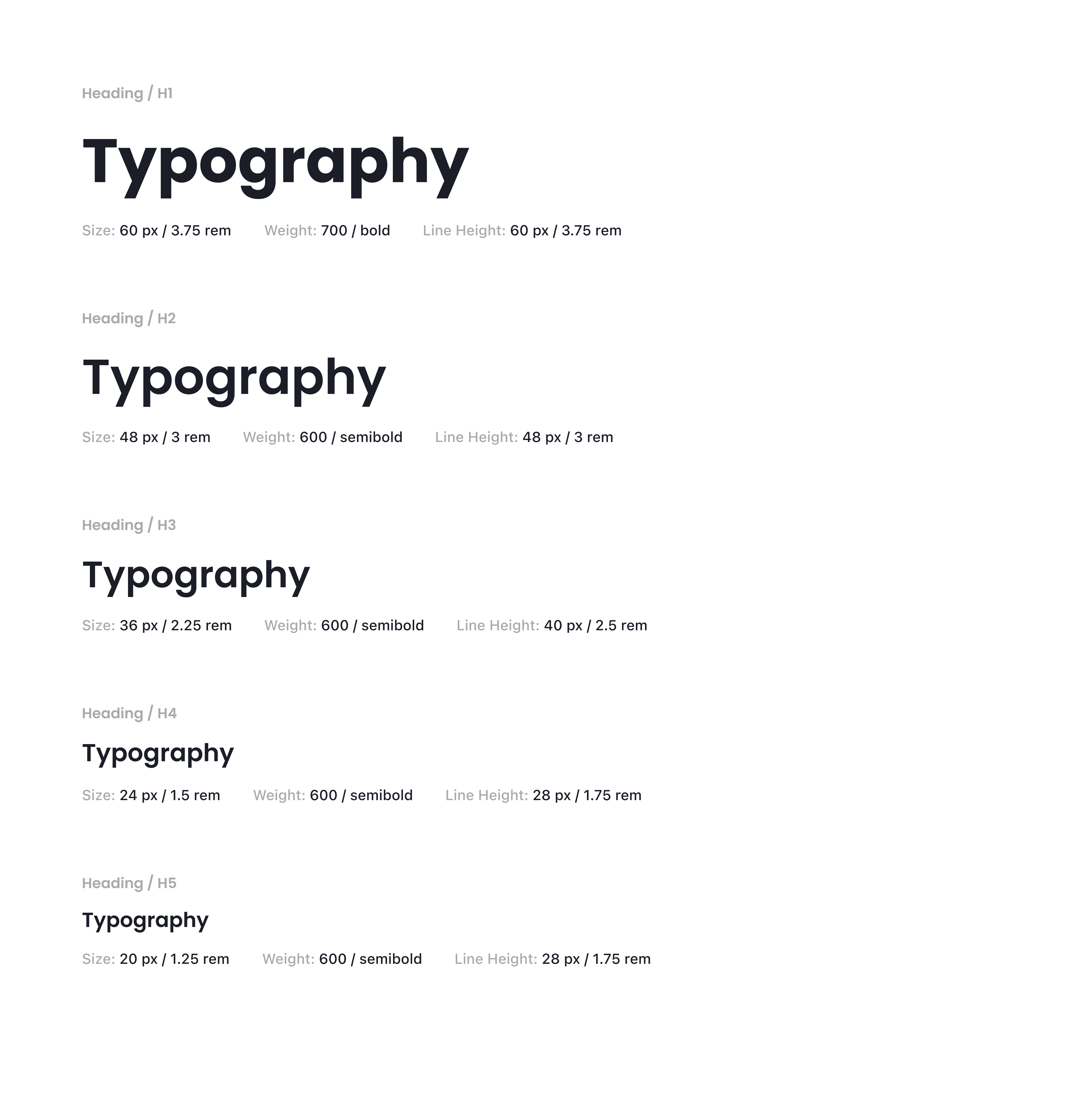
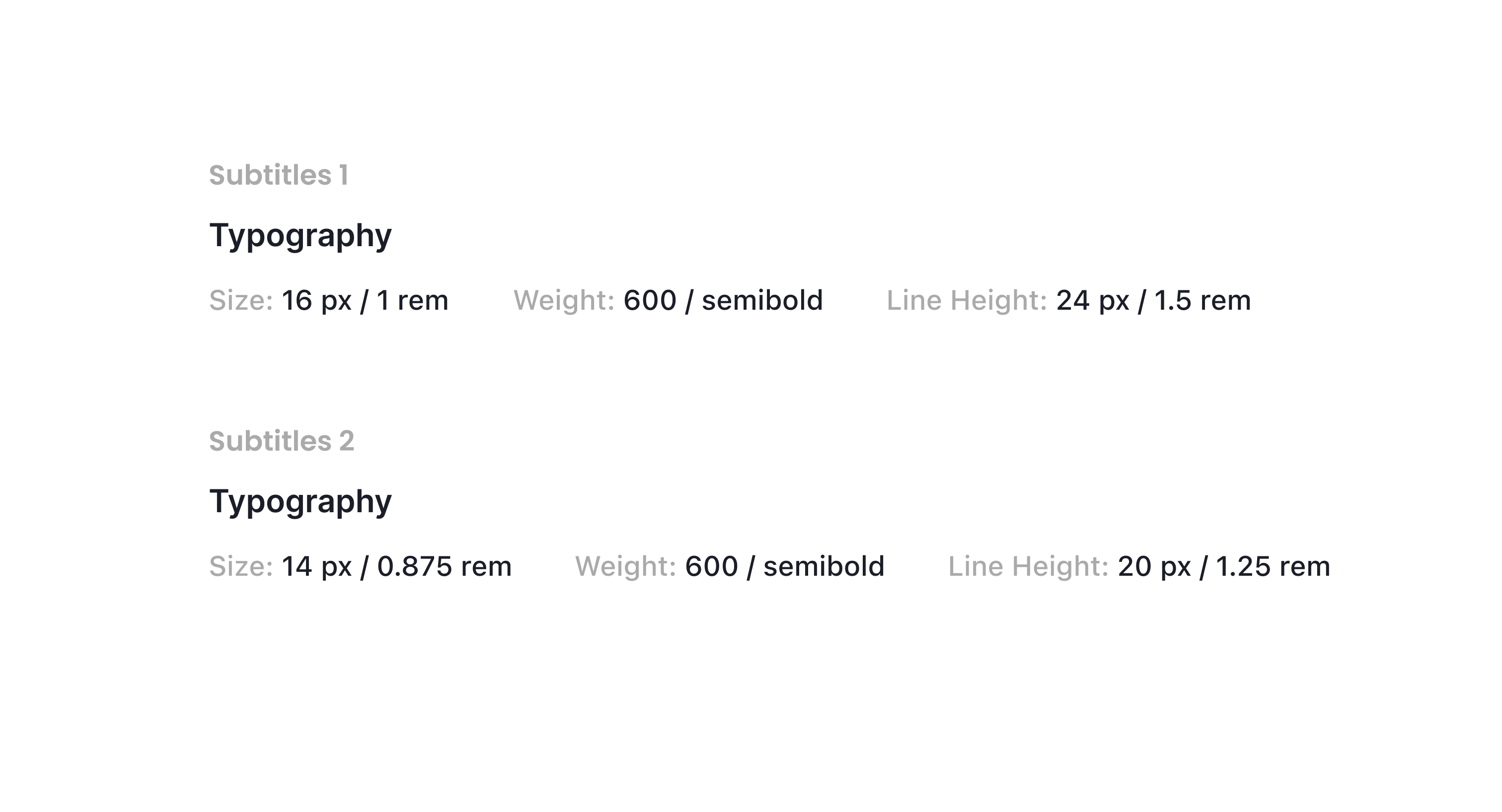
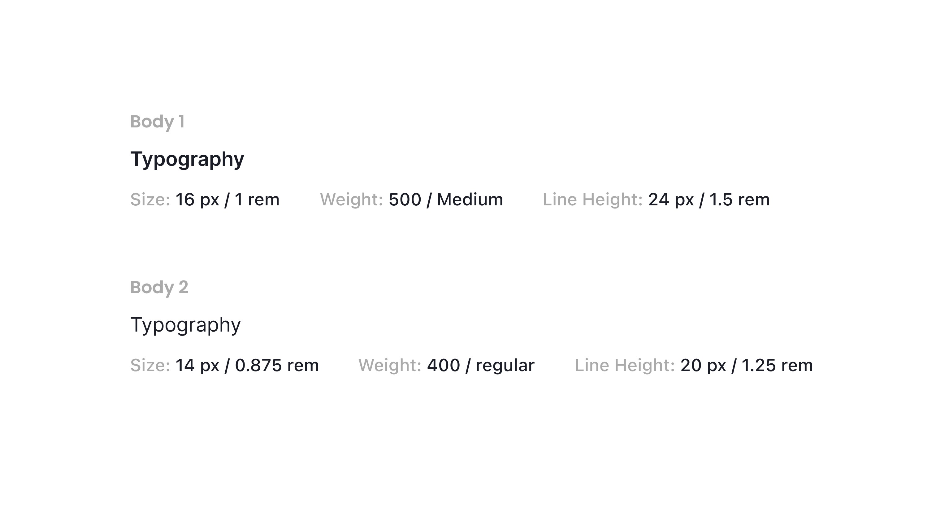
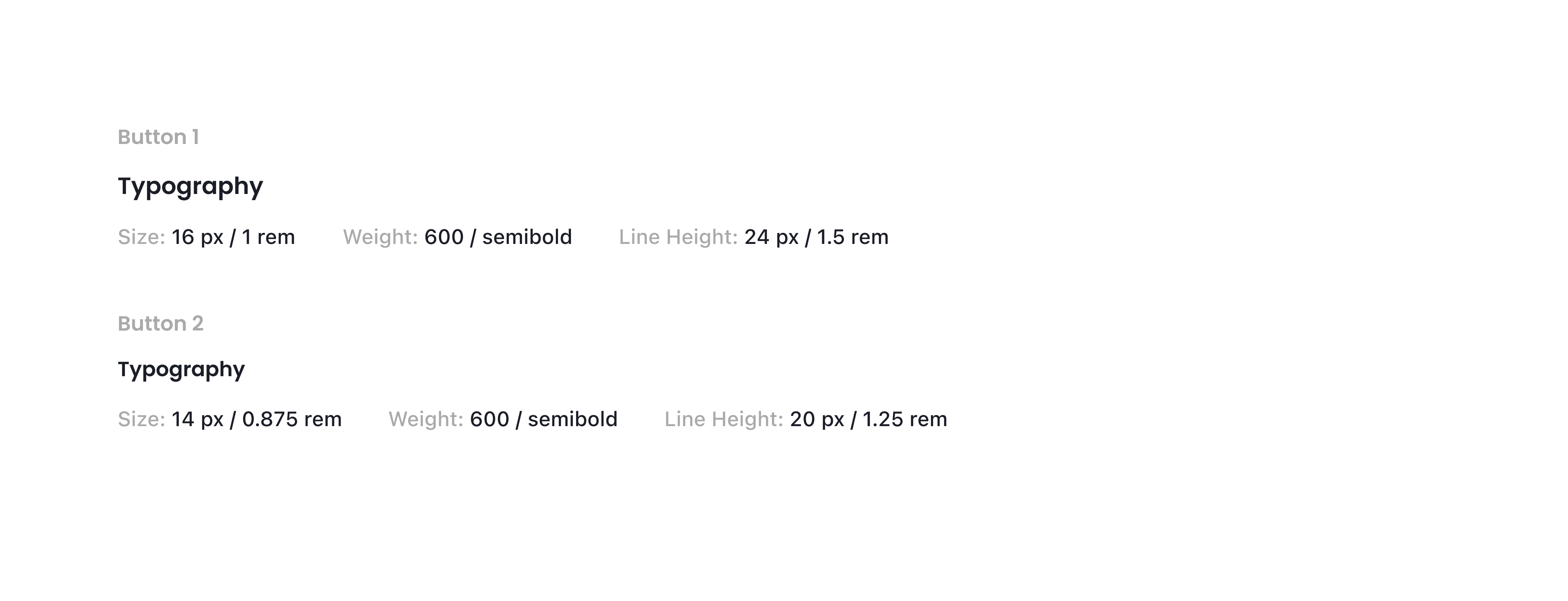
 Typography
In our typographic system, unique and clearly defined names are used as design tokens.
The system establishes both title and body text styles and provides clear guidance on when and how each
should be applied.


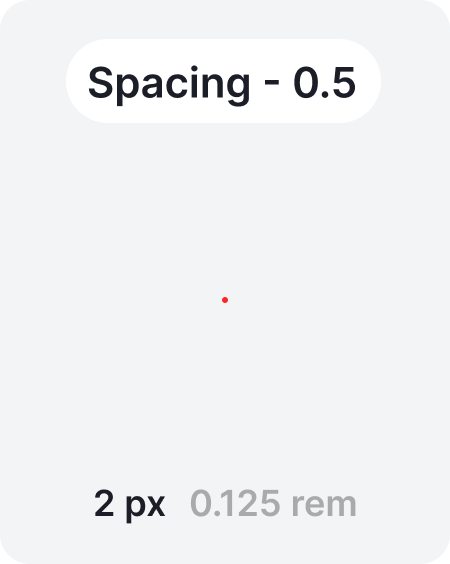
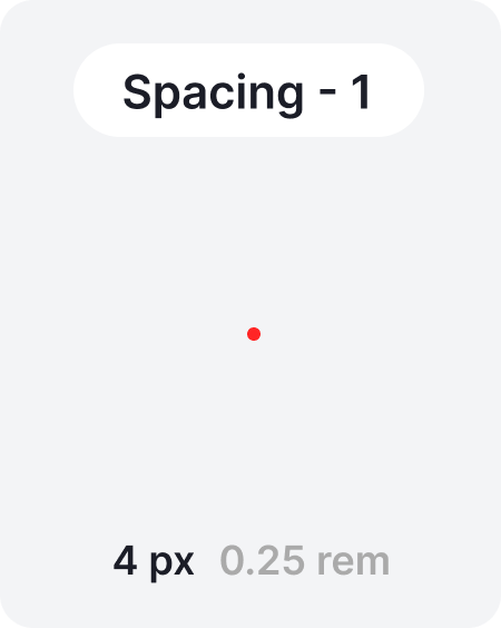
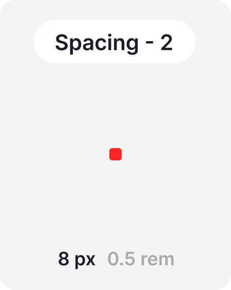
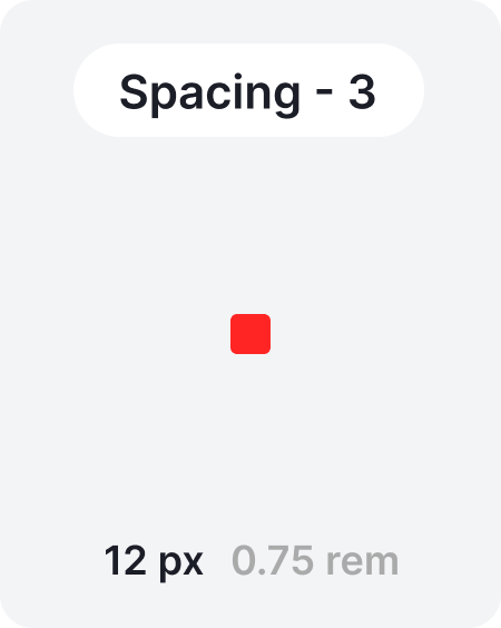
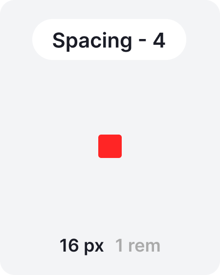
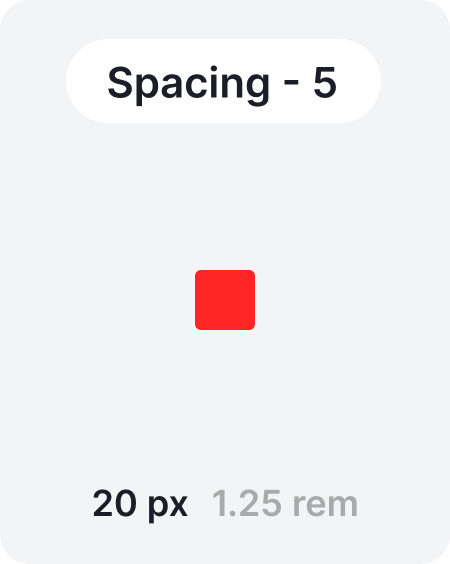
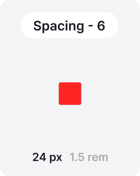
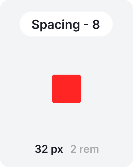
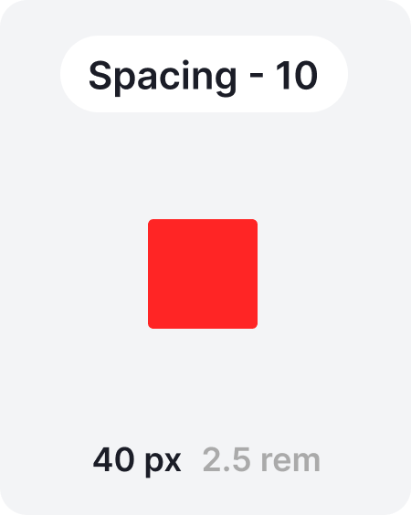
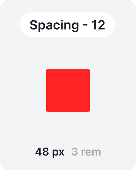
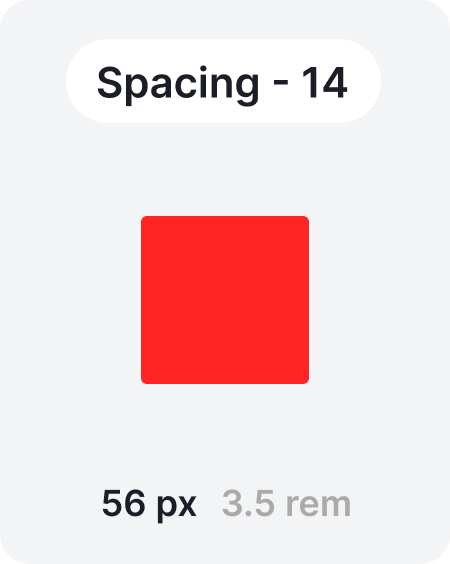
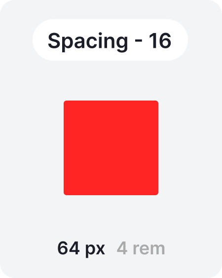
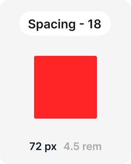
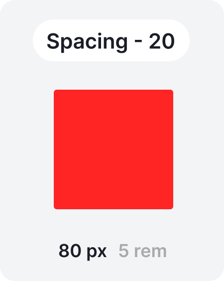
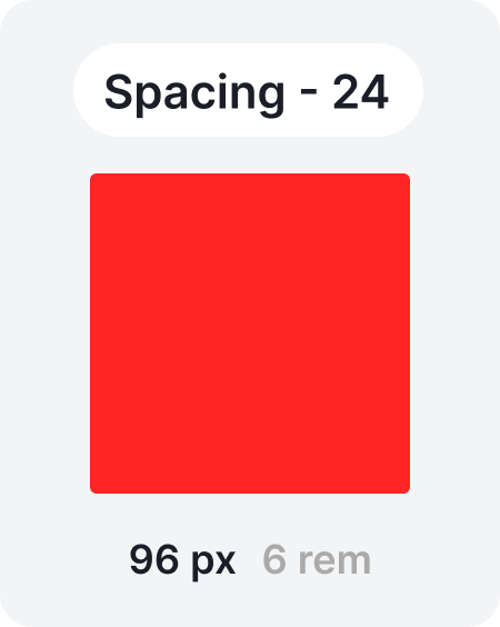
 Spacing
Our spacing system is based on multiples of four, ensuring consistent alignment and rhythm across all layouts. As a slight exception, the value “2” is introduced as the smallest spacing unit.These spacing principles must be used between components, and, where possible, are also recommended within components to maintain harmony.

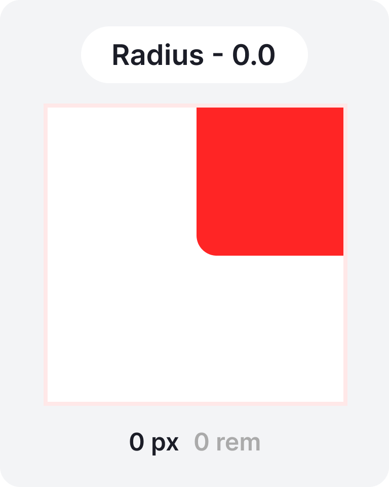
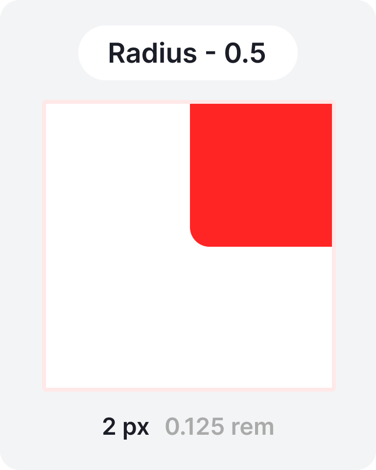
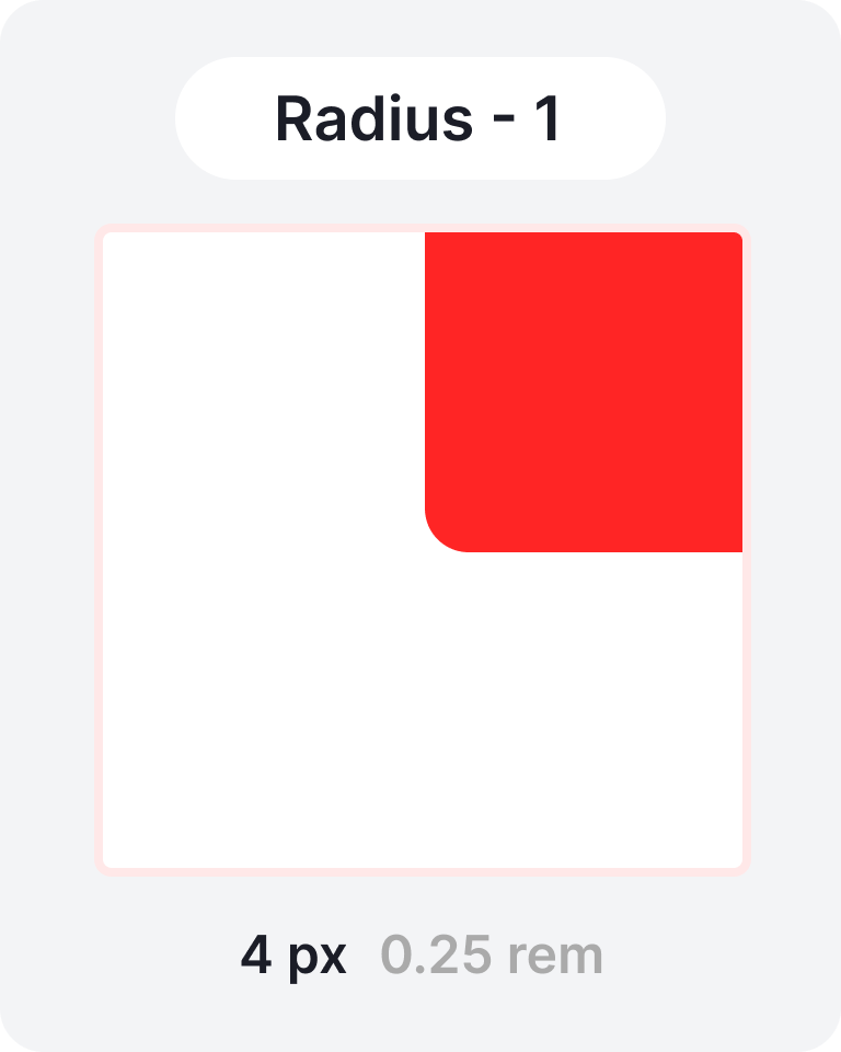
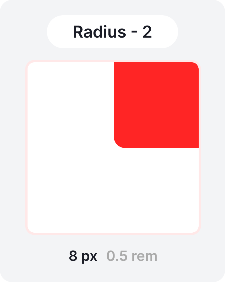
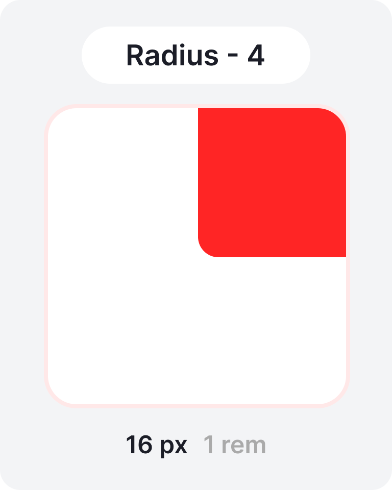
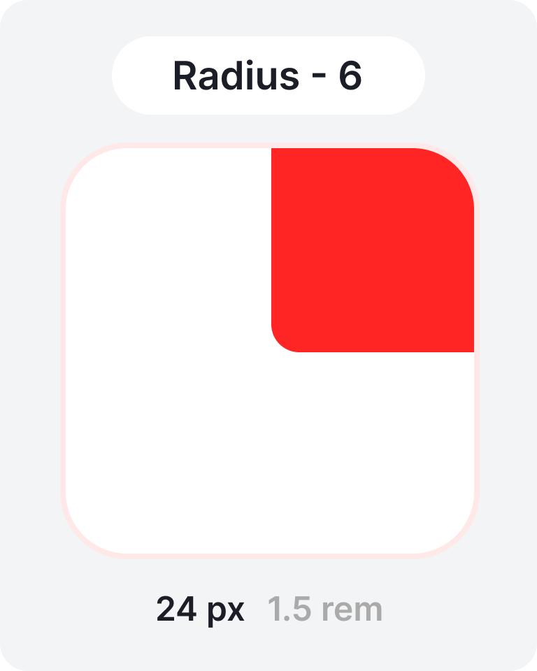
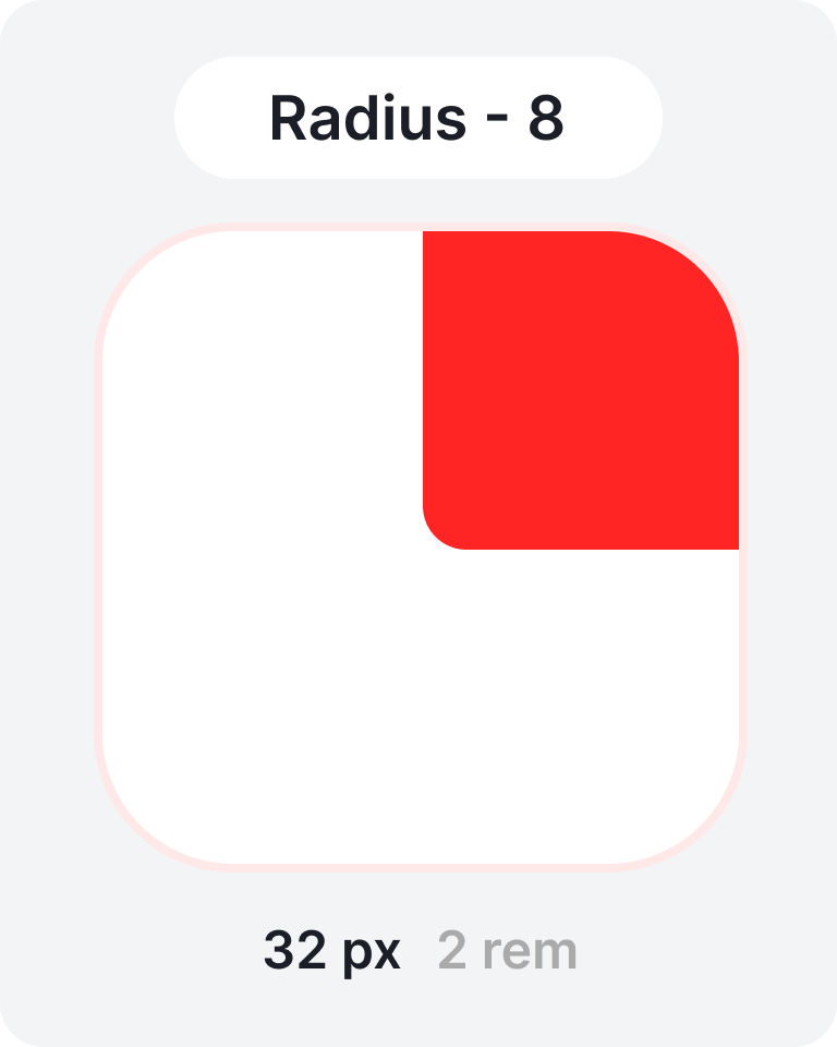
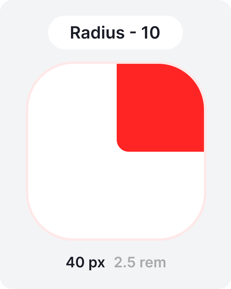
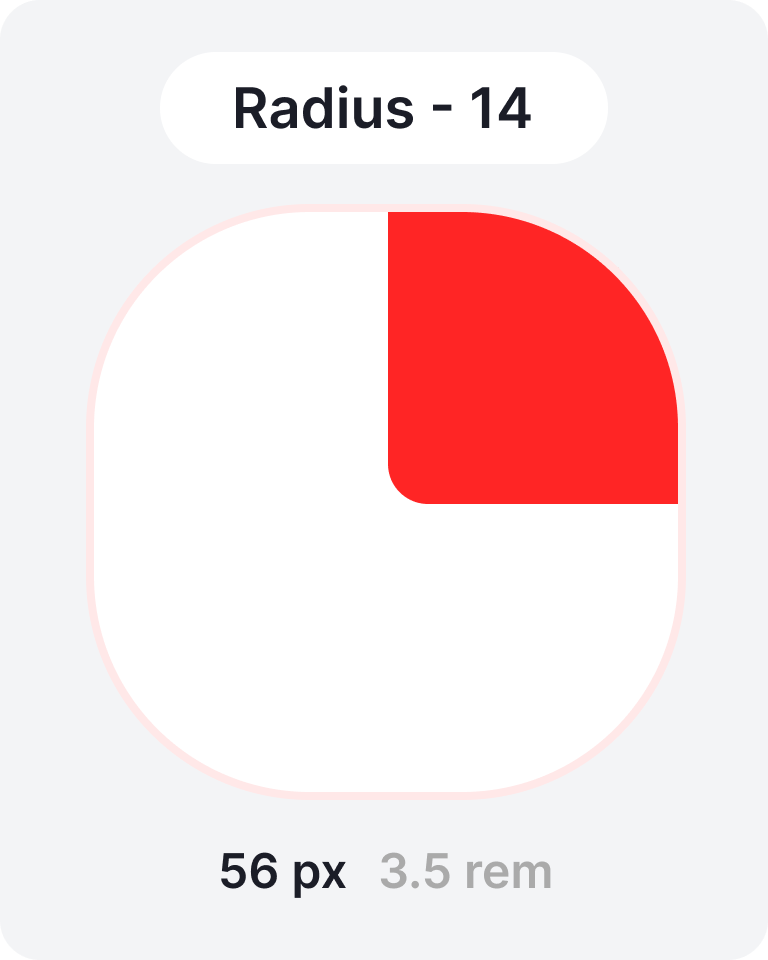
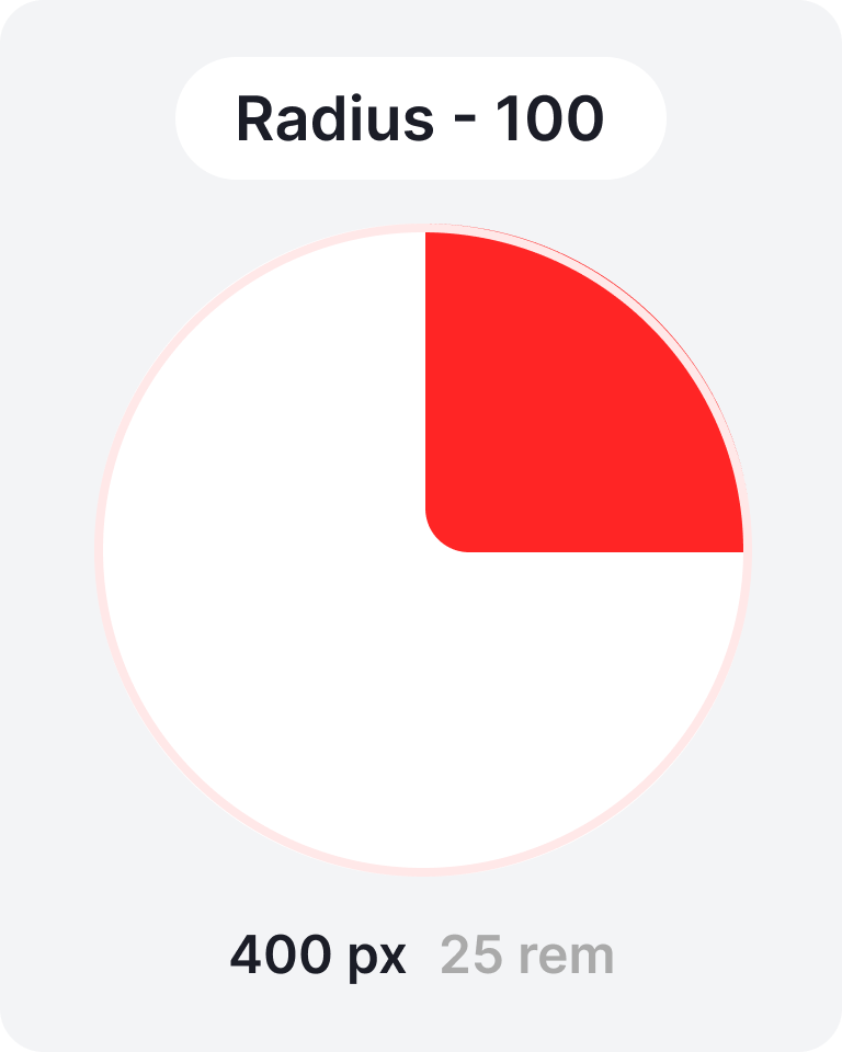
Corner radius 
To achieve visual consistency and scalability, we rely on a modular corner radius system that increases in 4-pixel increments.
This modular approach ensures a unified aesthetic while allowing
flexibility for different UI elements and contexts.
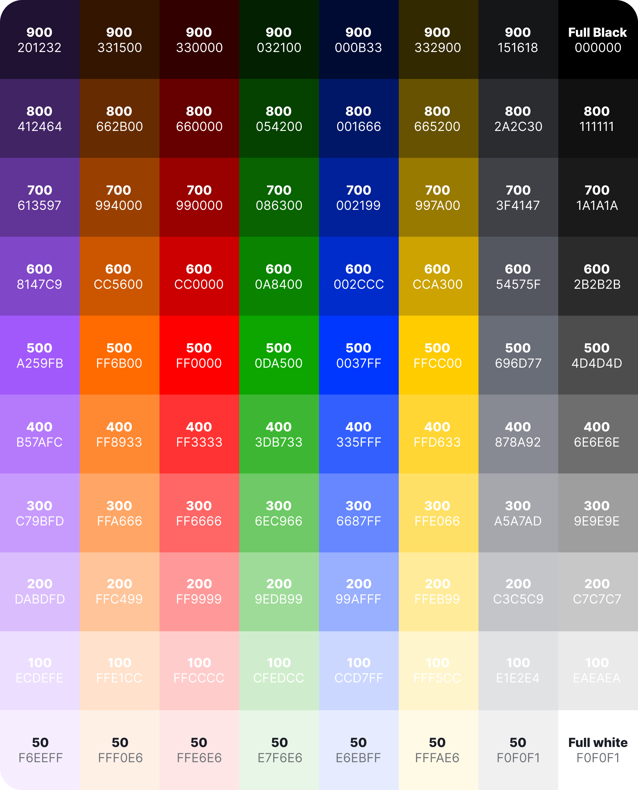
 Colors
The color system is built on variable-based tokens and includes base colors and semantic color tokens. Here, purple serves as an example of the primary brand color, while orange functions as an accent color. The palette also incorporates a system palette and a grayscale palette, both supporting light and dark themes for accessibility and contrast balance.
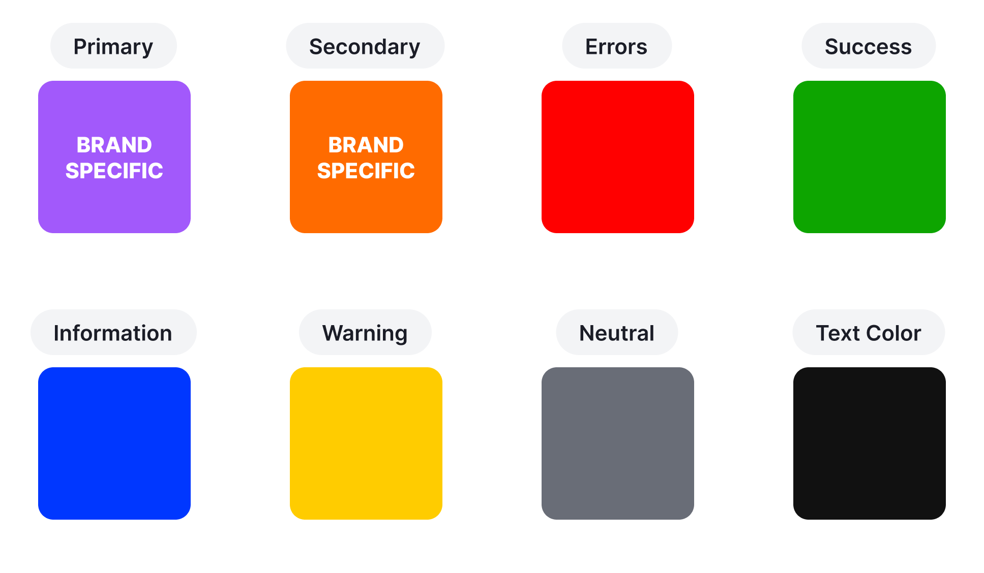
During implementation, the sample brand colors (purple and orange) are customized to align with the client’s actual brand identity. If a brand color is found to be too similar to other tones within the system, the palette will be refined to ensure each color remains distinct and meaningful in its role.
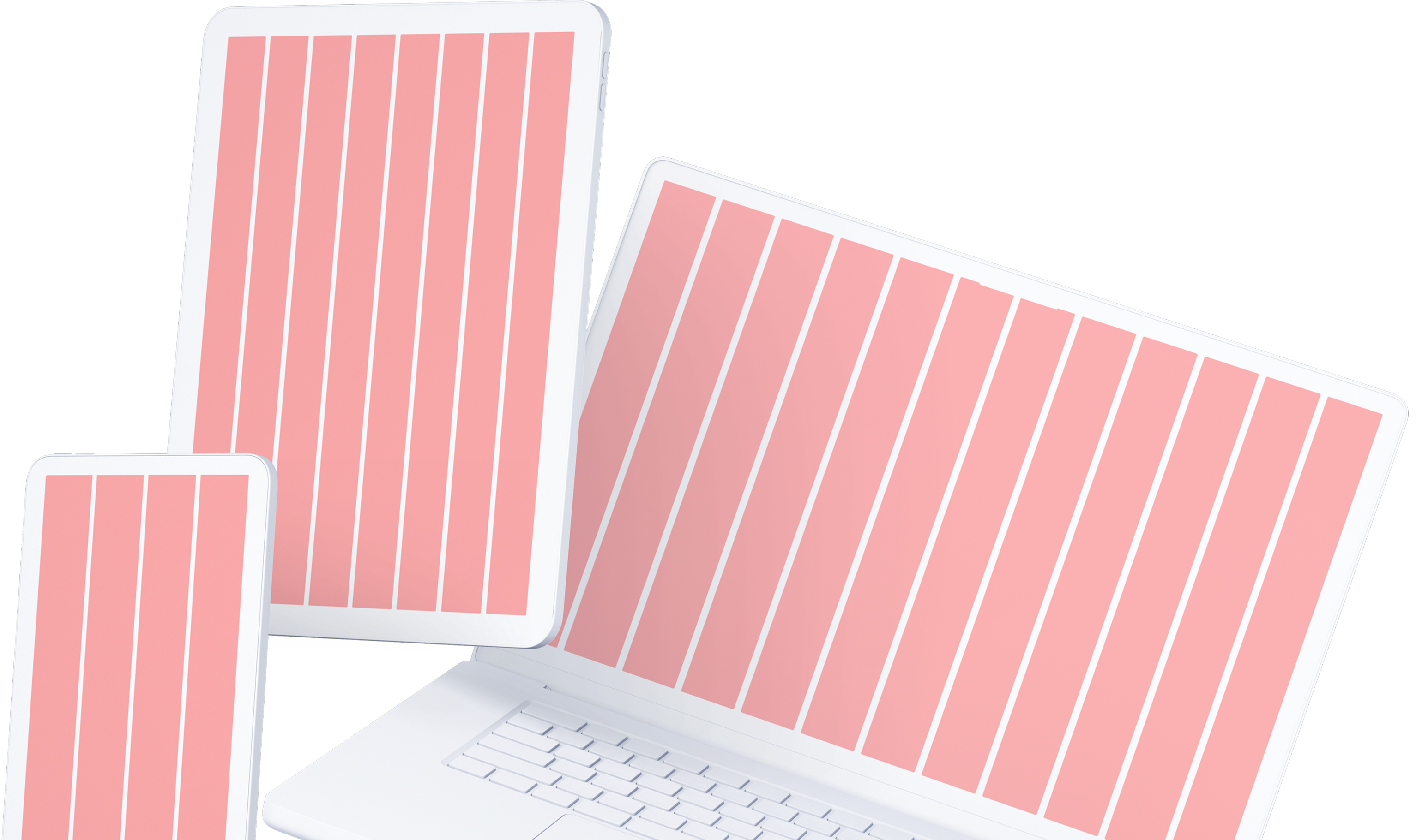
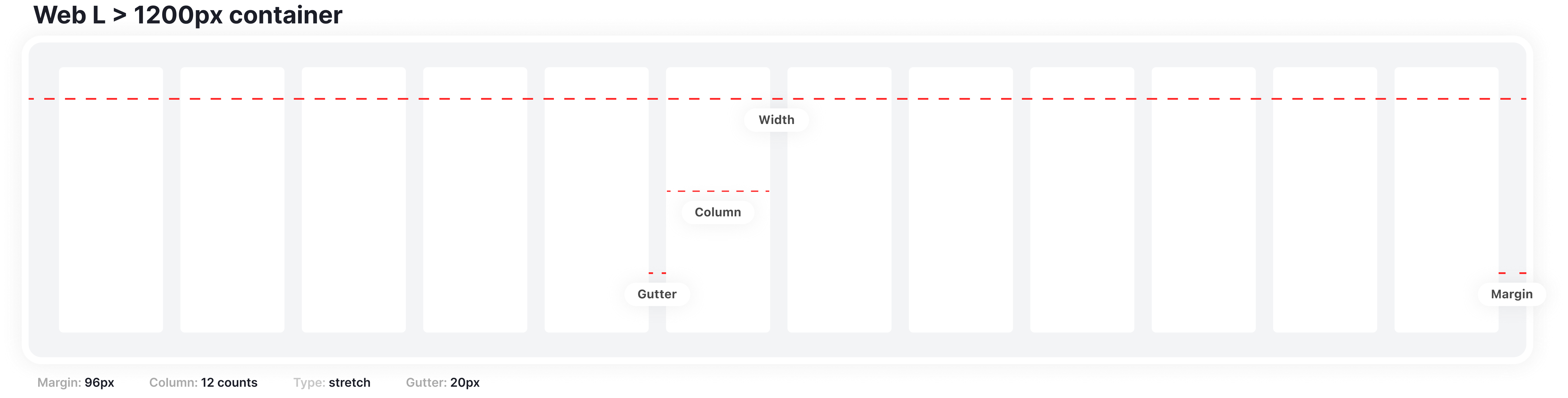
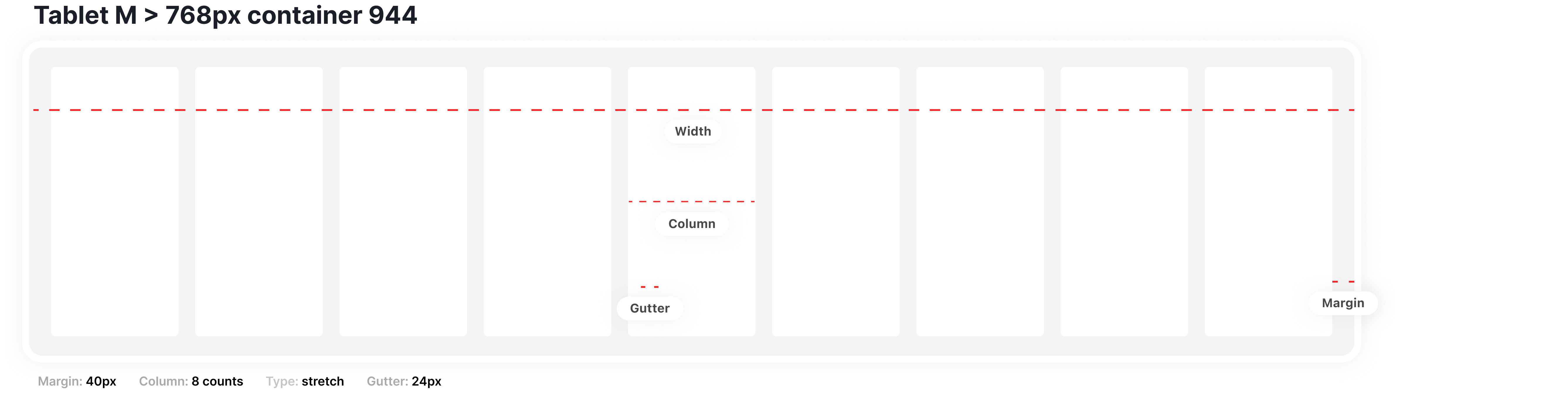
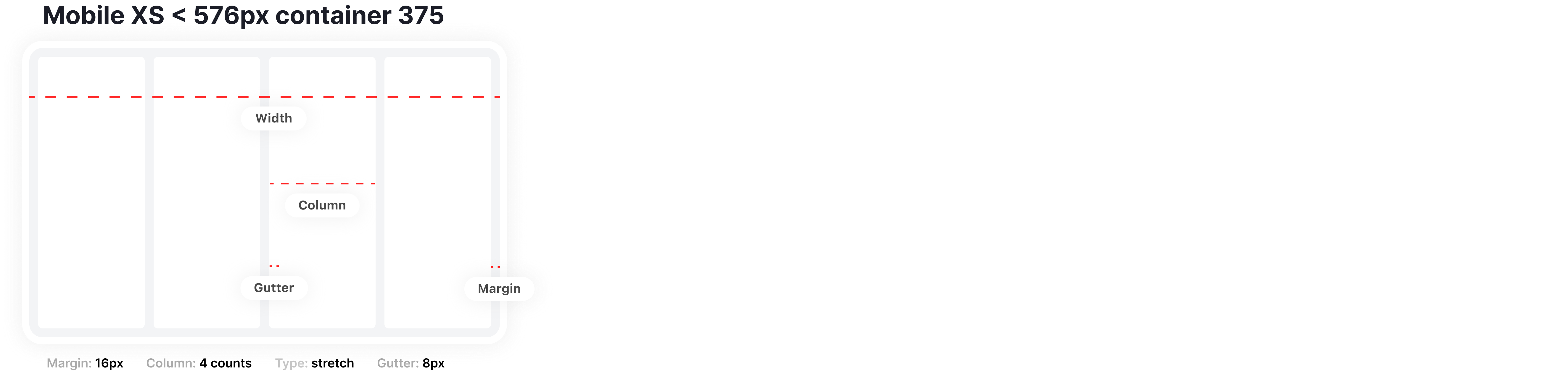
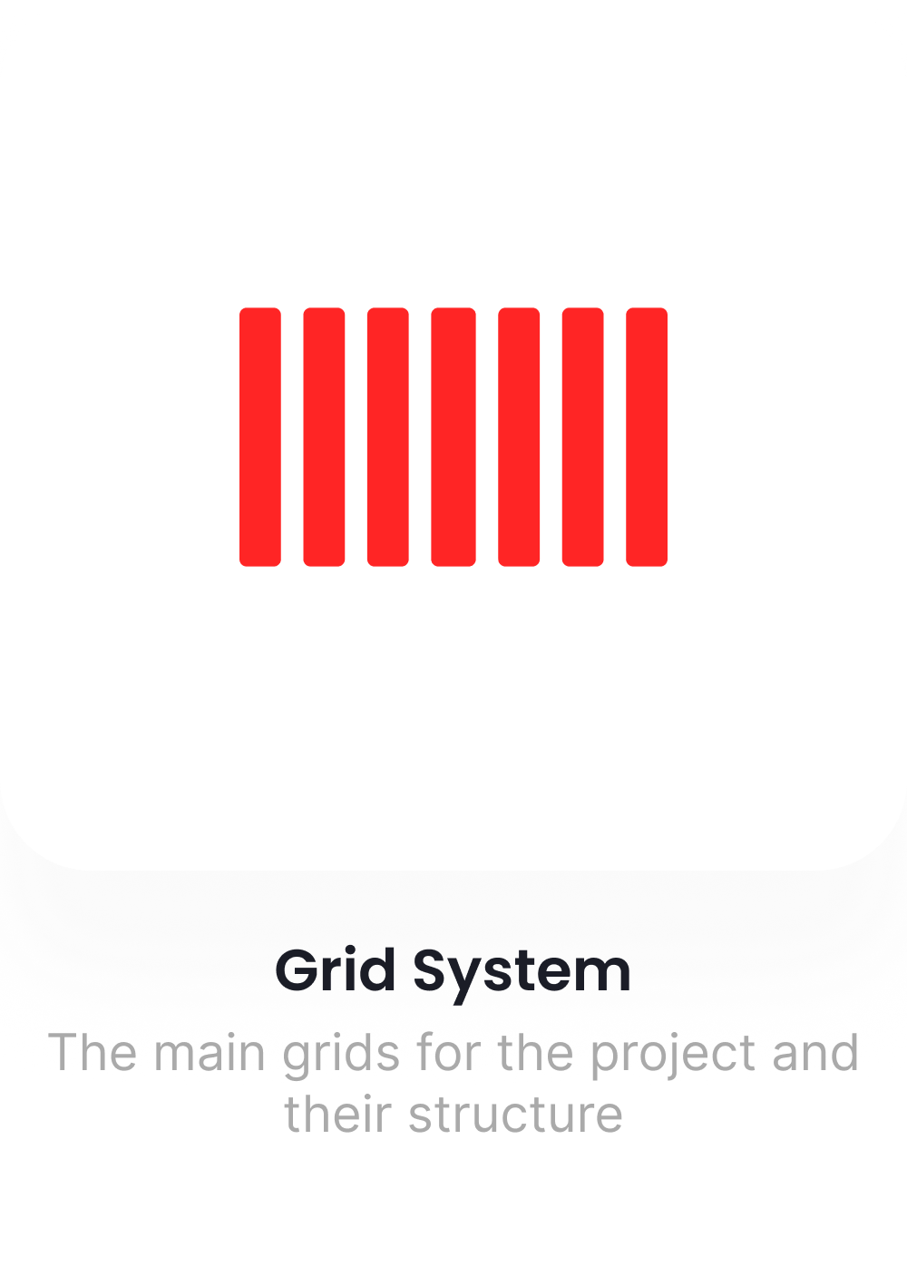
 Grid
Grid
Our layout grid system is fully responsive, adjusting smoothly to different screen sizes and devices.
On desktop, it uses a 12-column grid; on tablet, an 8-column grid; and on mobile, a
4-column grid.
Each grid follows a 4px spacing foundation, ensuring precise alignment and consistent visual rhythm across all breakpoints.
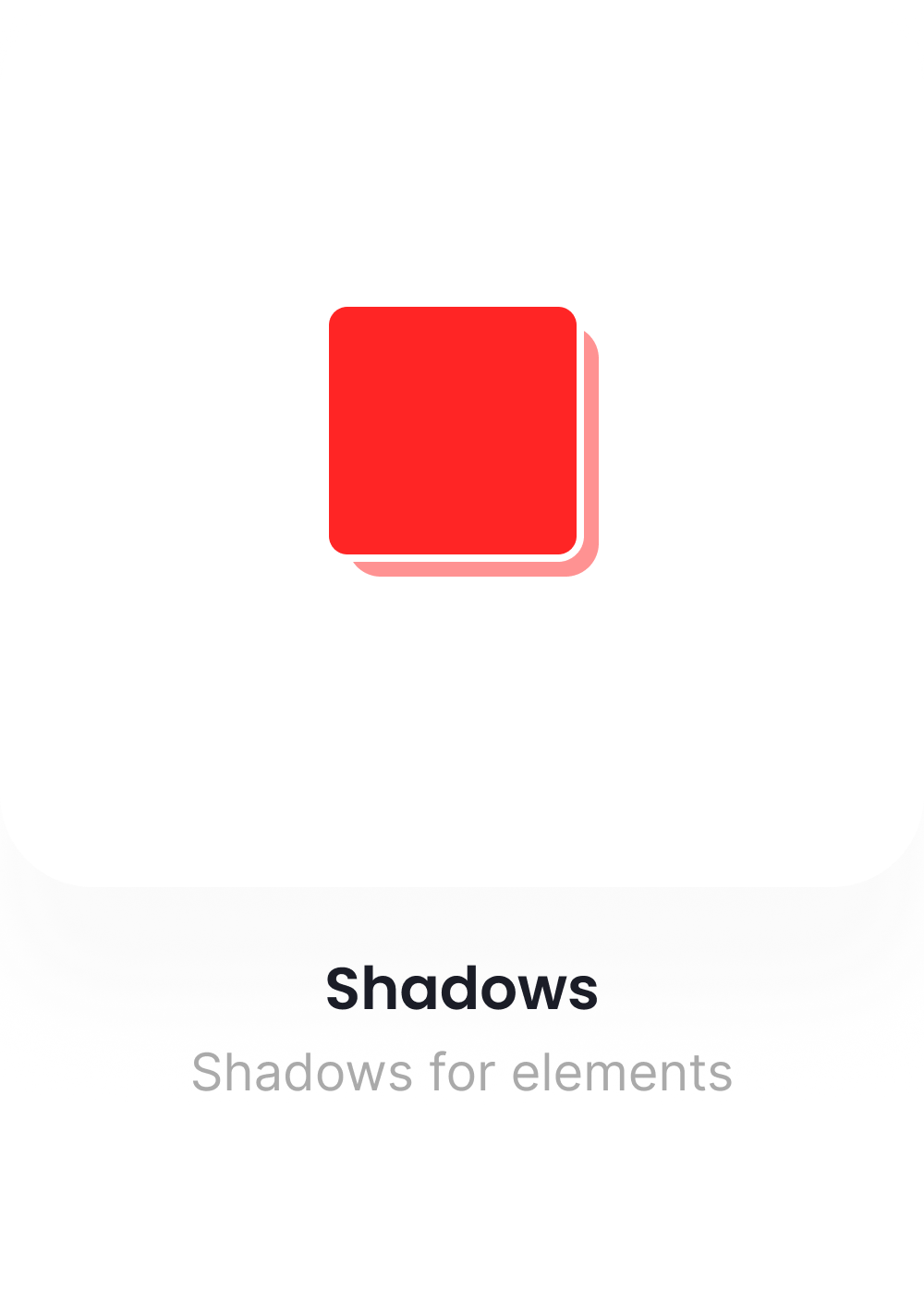
Shadows
The shadow system introduces depth and hierarchy within the interface. It’s built around a series of standardized elevation levels, consistently applied to elements such as cards, modals, and interactive surfaces to enhance visual clarity and focus.
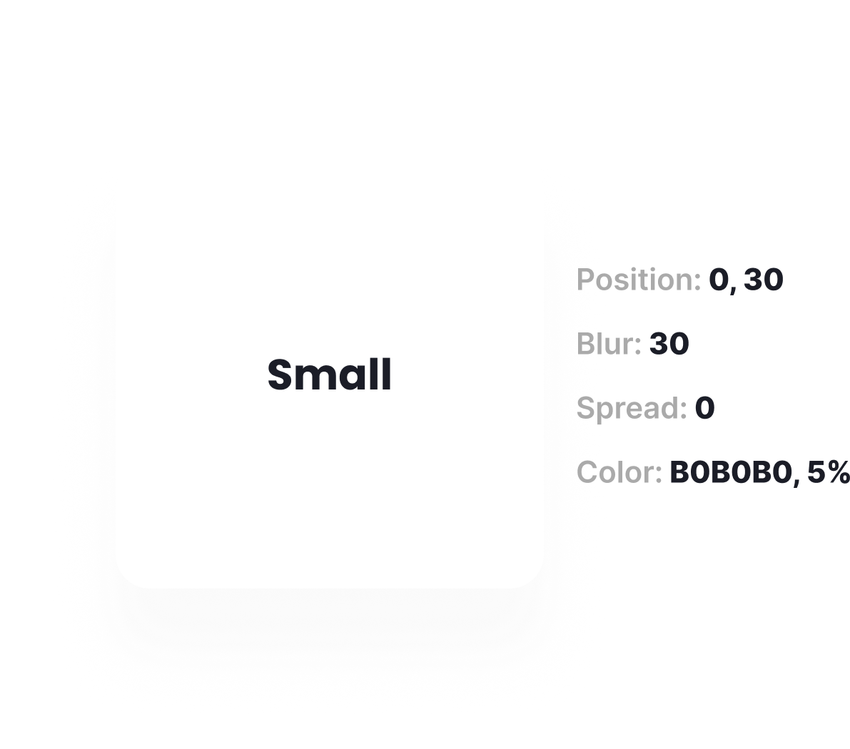
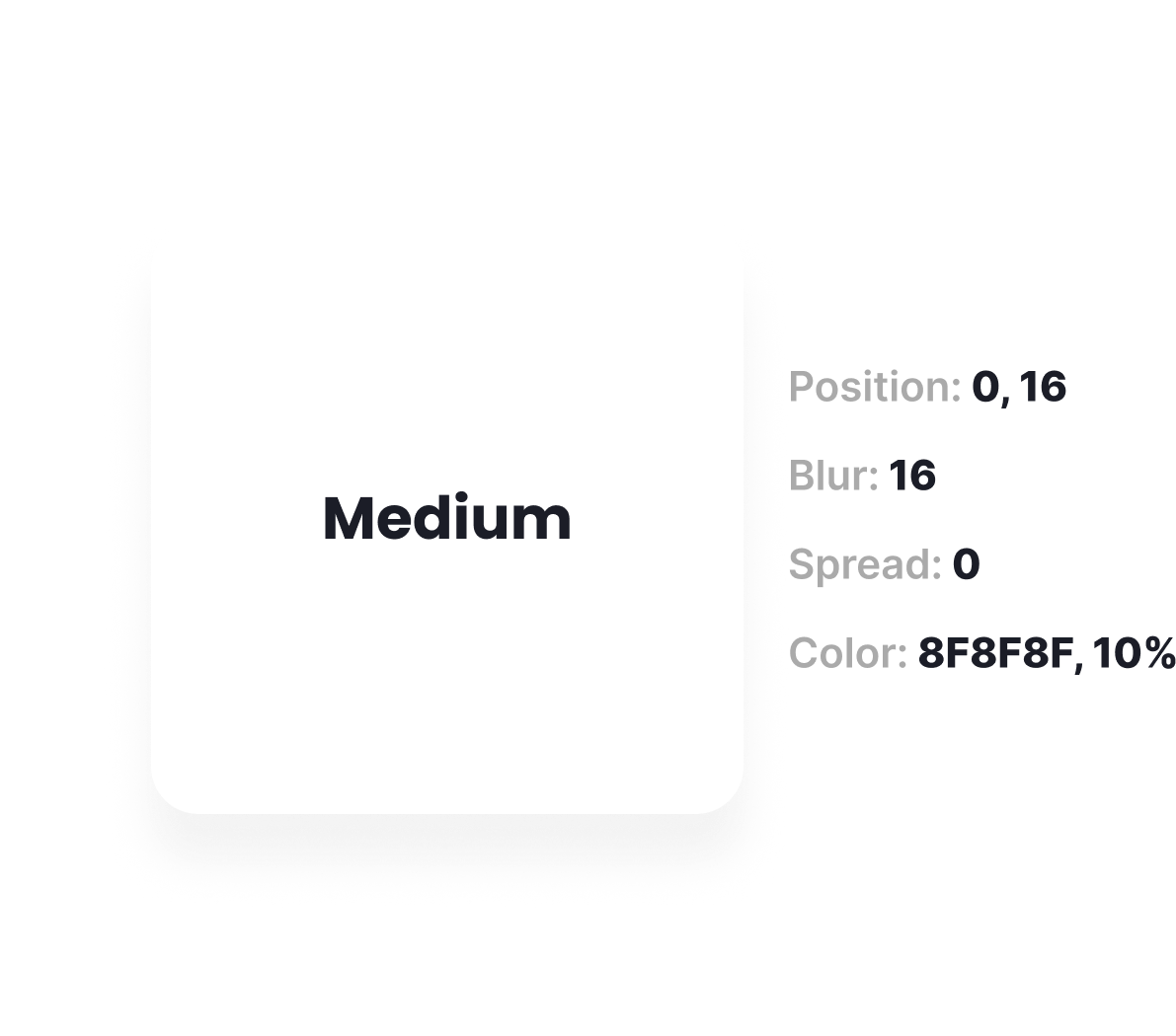
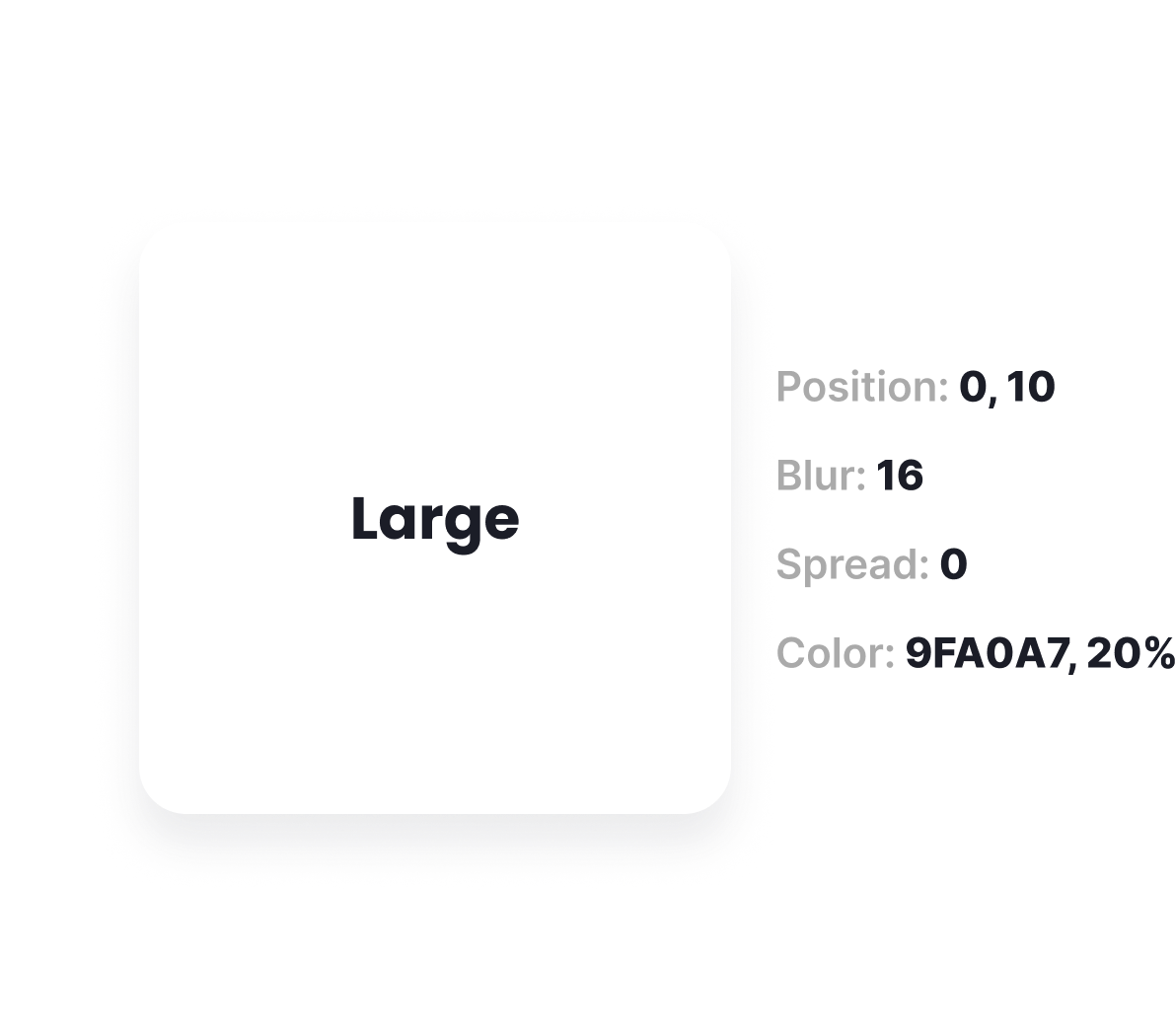
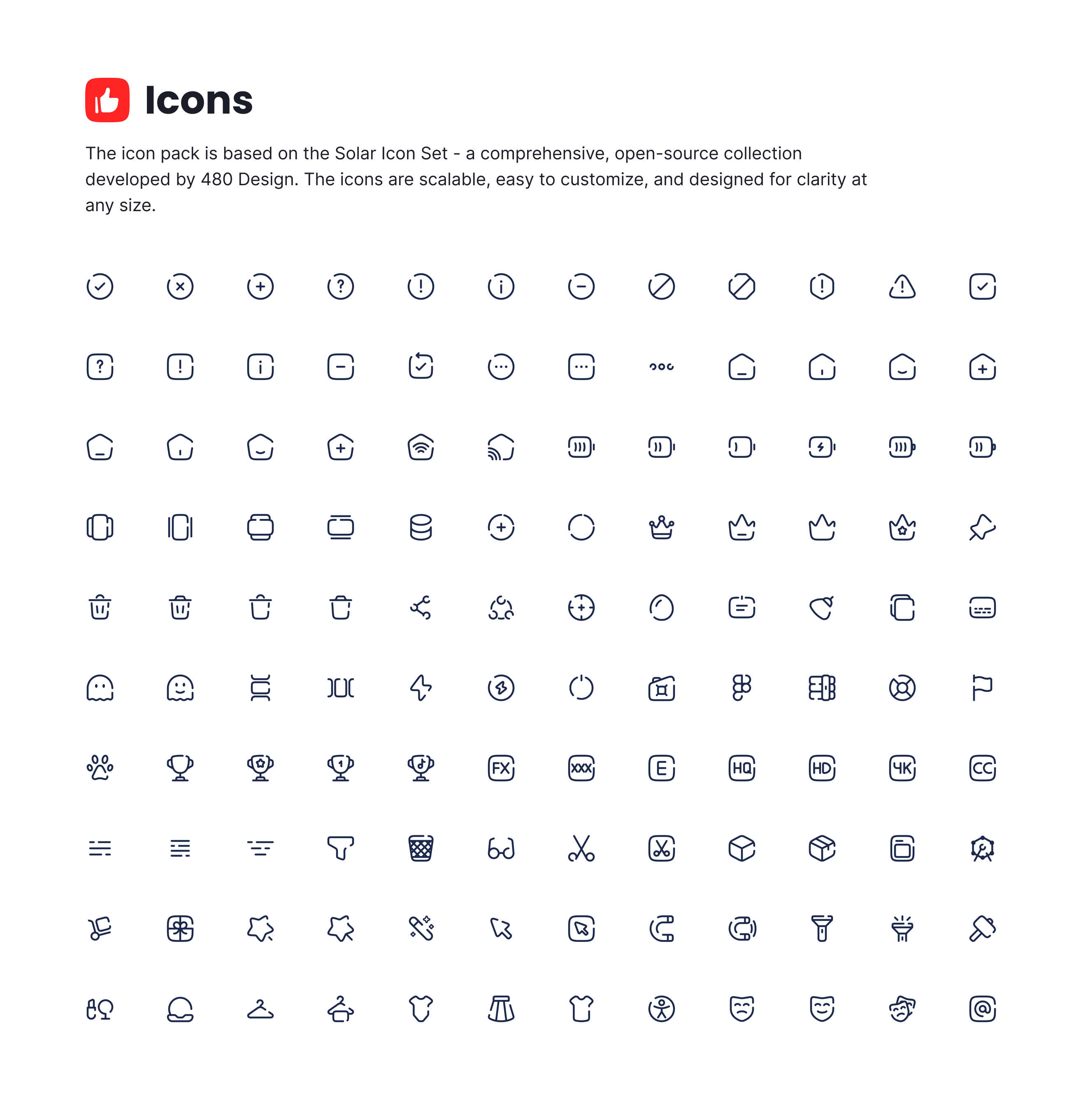
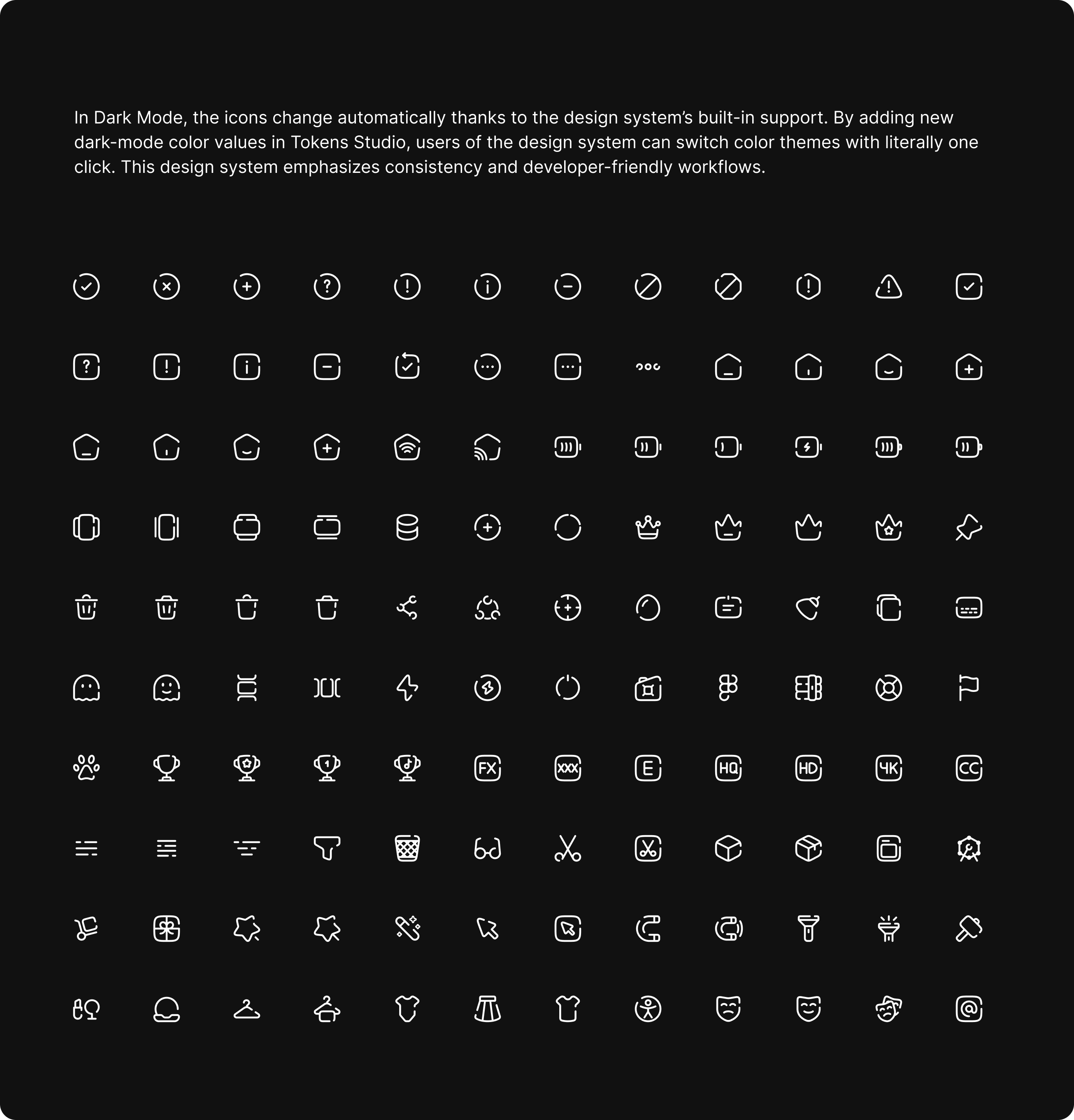
 Table of Content
The Table of Contents functions as the primary navigation hub of the component library. It offers a clear, well-structured overview of all design resources—including components, patterns, and style definitions. Organized into logical categories, it enables designers and developers to easily locate and explore the assets they need for efficient workflow.
Fundation
Components


If you want see full project
Visit my behance and see my full experience in design systems!
Click this